Here’s five ways to make people hate your mobile app. I mean, there’s probably hundreds of ways. I can certainly think of dozens of ways, but these are five that come to mind because I encountered all of them this week. So in no particular order here they are:
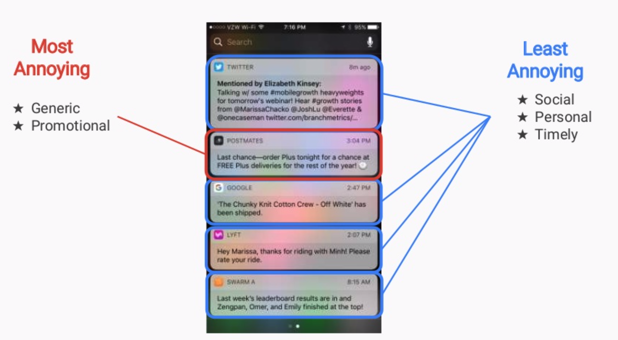
- annoying push notifications
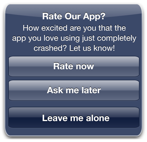
- begging for likes and reviews
- nonstandard navigation
- failing to respond to input and finally
- not working on older devices
Annoying Push Notifications
Let’s get started with annoying push notifications. If your app is designed around notifications, it’s supposed to nag people on a regular basis - that’s ok. That is a valid use of notifying users all the time. Any other nagging of the user using notifications is pretty much an abuse of the system. And remember, once the user disables notifications, you’re basically screwed cause you’re not allowed to prompt them to re-enable notifications if they’ve been turned off.

Begging for Likes & Reviews
Next up, begging for likes and reviews. I’m not sure anyone actually likes when an app prompts them for likes and reviews, but there are better and worse times to do that prompting. For example, when the user first opens your app up, they’re probably trying to accomplish something useful. If you prompt them for a review at that point, all you’re going to do is annoy them. Why not wait until after they accomplish something in your app, some success, some end of state, and then prompt them for review. They’ll be in a much better frame of mind and you probably won’t be interrupting them.

Non-standard Navigation
Next we have non-standard navigation. Folks, it’s called standard navigation for a reason. Standard navigation is familiar to people. When you’re on an Android device, the way navigation works in all the built-in apps is standard. When you’re on an iOS device, an iPhone or iPad, the way navigation works on those devices is the same in all the built-in apps as well. When you depart from that standard, because it’ll be cool or unique, what you’re actually doing is forcing the user to have that extra cognitive load, that moment of trying to figure out what they’re supposed to do next. Where that back button is; where the close button is. So if you push that load onto the user, they won’t like you and they won’t like your app.
Failing to Respond to User Actions
There’s lots of times when your app is going to be busy. It’s okay if it’s busy working on a thread in the background. It shouldn’t ever be busy on the main user interface thread. Let the app continue to respond to the user or if there’s some reason why that’s not feasible, give them some sort of good visual feedback that lets them know the app is busy. Don’t just give them the blank stare and leave them tapping and tapping on the screen waiting for something to happen that never does.
Not Working on Older Devices
And finally we have apps that do not work on older devices. Now, iOS devices tend to get all the latest upgrades. Which is to say the the latest updates work all the way back to the iPhone SE, but not all Android devices will get the latest Android updates. In fact, damn few of them (Android devices) get more than one or two. And these older devices are also slower. So if you are using an app on your brand new iPhone 11 Pro and it doesn’t actually work that well on somebody’s brand new iPhone SE that they picked up at Costco (because they’re clearing them out), well, they’re going to get angry at your app.
These are just a few of the reasons people will hate your app, but most of them are things that you have total control over, and they aren’t that hard to fix or avoid.
So get out there and make sure your app isn’t one that users hate.
Meanwhile, our 6 Pack Apps program is reopening this spring.